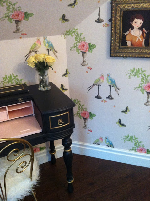
You may remember the pretty that happened #projectlittlemiss...
...well, as you may know, this room was the first of MANY rooms in one gorgeous home to be transformed.
So...as work on the lucky little girl's room finished...
...we began thinking about her brother's room.
And so far, we've got this going on...
Grey on all the doors and trim, C&S Woods wallpaper on all the walls and Schumacher dogs on all the windows...the opposite wall actually has a set of ripple fold drapes in the same and wowzers it's good.
A full reveal of this room will be coming soon.
And...as we're wrapping up in there, our attention has shifted to the home's grande foyer.
I'm a total believe that the entrance to your house should be where all stops are pulled out...the space serves as the first impression of your home and connects everything else together so it should reflect your overall aesthetic...it's definitely where I like to start when coming up with an entire house re-do.
In this home (now to officially be called #projectwholehouse,) we've really thrown balls to the wall and gone big.
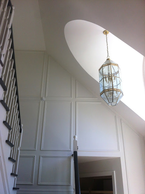
The whole space started with the addition of that incredible moulding I've shown you...as a quick reminder, here it is again (can you tell that I luuuuurv it)...
...I'm also in mad love with those antique chairs...casters will be added to the feet to boost them up a bit.
Now...moving forward...we're about to order up some insanely good lighting and furniture.
We've got this loveliness coming...
....aka...
...and I can't wait.
On top of the furnishings, we've come up with what I think is one heck of a lighting plan.
Our first go at it looked like this...
The Areteriors Caviar fixture (balls) was planned for the two story large window... the Trillion flush mount (my all time favourite) was for the landing at the top of the stairs...the Soleil pendant was sourced for the upstairs hallway...and the Olivia sconces were picked for over the black chairs beside the entrance...oh and the picture sconce was for the stair landing.
After considering all our options, I decided on nixing the picture sconce and replacing it with a third Olivia...we also added another Soleil for the back mainfloor hallway by the powder room.
And then, another change evolved...turns out my client's hubs wasn't totally in love with the balls.
And since I only want to spend other people's money on things they're truly obsessed with, I resumed the search.
Some of you may know how obsessed I am with lighting choices in general...in my own home, this is where I go the most OCD and am always completely fixated on finding the absolute perfect fixture.
So needless to say, I was happy to resume the search.
After evaluating and eventually dismissing hundreds of choices (mostly because they weren't the right proportion for such a big space...turns out that finding long and appropriately wide fixtures isn't the easiest) I found this rooms equivalent of lighting nirvana...
...at 68" in length and 27" in width, it's literally PERFECTION in the space...
...and the fact that my awesome clients are willing to invest in such a fantastical fixture...well, let's just say that I LOVE them for it.
So as of now, we're about to splurge on all of this perfection...
...and I...could. not. be. happier...and slightly more jealous for that matter;)
A ginormous reveal is promised once everything is in place.
In the meantime, I noted a few more gorgeous pieces and Currey and Co., while perusing their site and have added them to my personal wish list...get a load...
...love your name and your style.
...you really should be mine.
And Dizzy coffee table...
...I do believe you're so ugly you're pretty.
All around yumminess no?
xo


