I'm excited to share a little interior design bliss with you today, thanks to the ridiculously talented
This inspiring designer just completed a gorgeous space for this years...
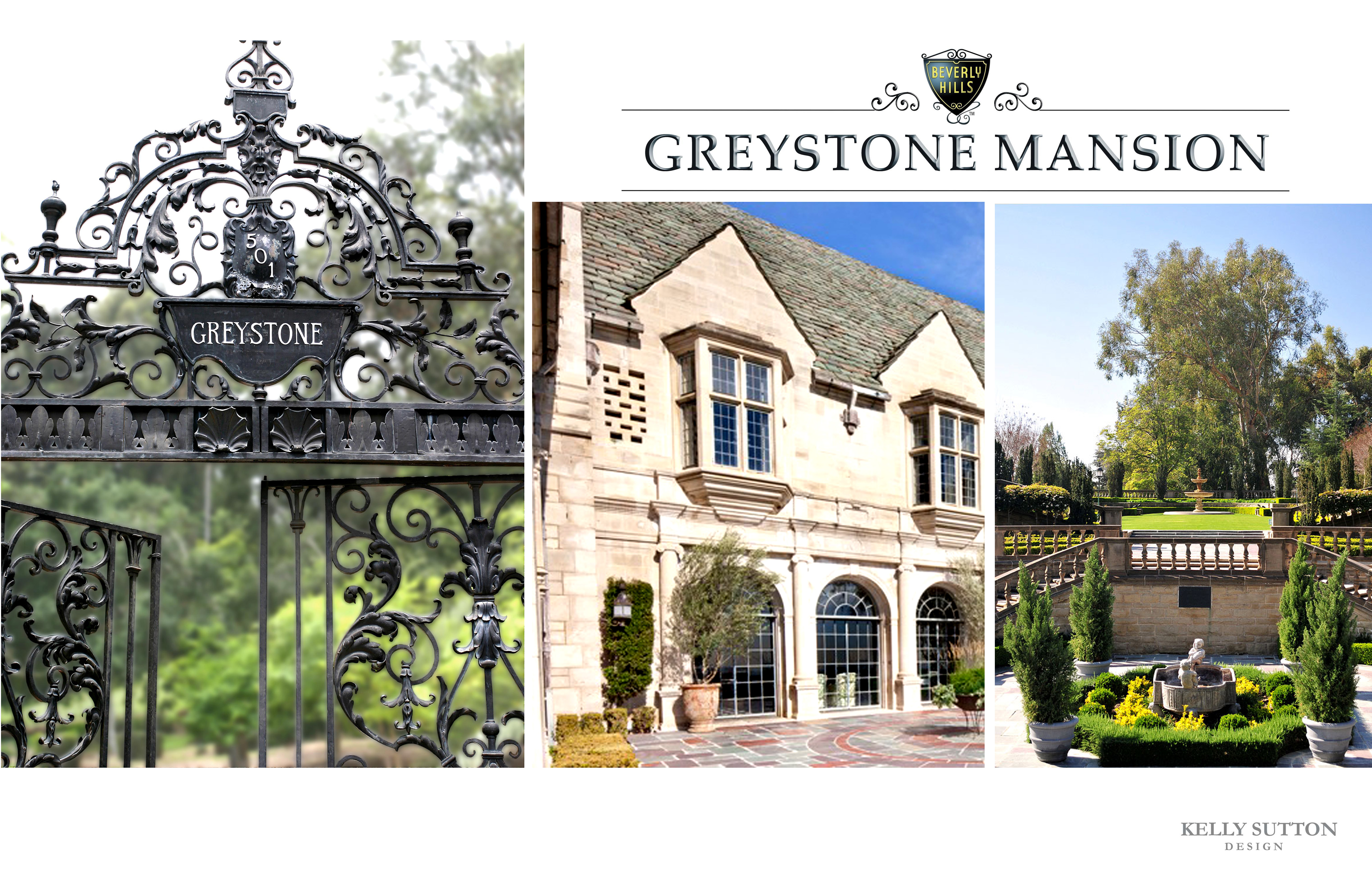
For this year's showcase, over 2 dozen designers were asked to create a room using a powerful business mogul as their muse. Julia Childs, Coco Chanel and Jim Henson were some of the 'titan's chosen by other designers.
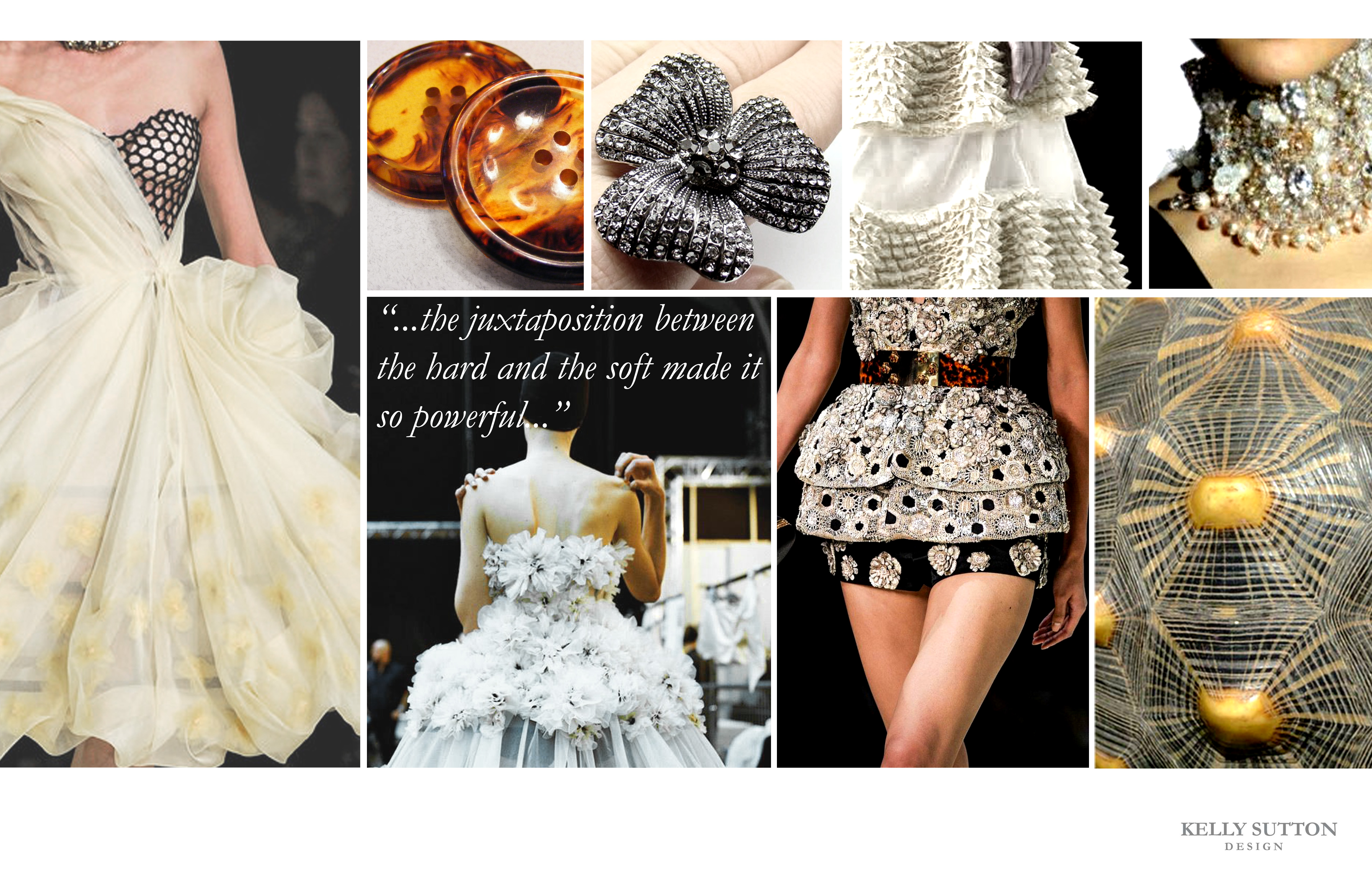
As for Kelly, she chose to be inspired by...

...and well, if you start with a person synonymous with glamour and sparkly things, y'all know the room is going to be pretty heavenly.
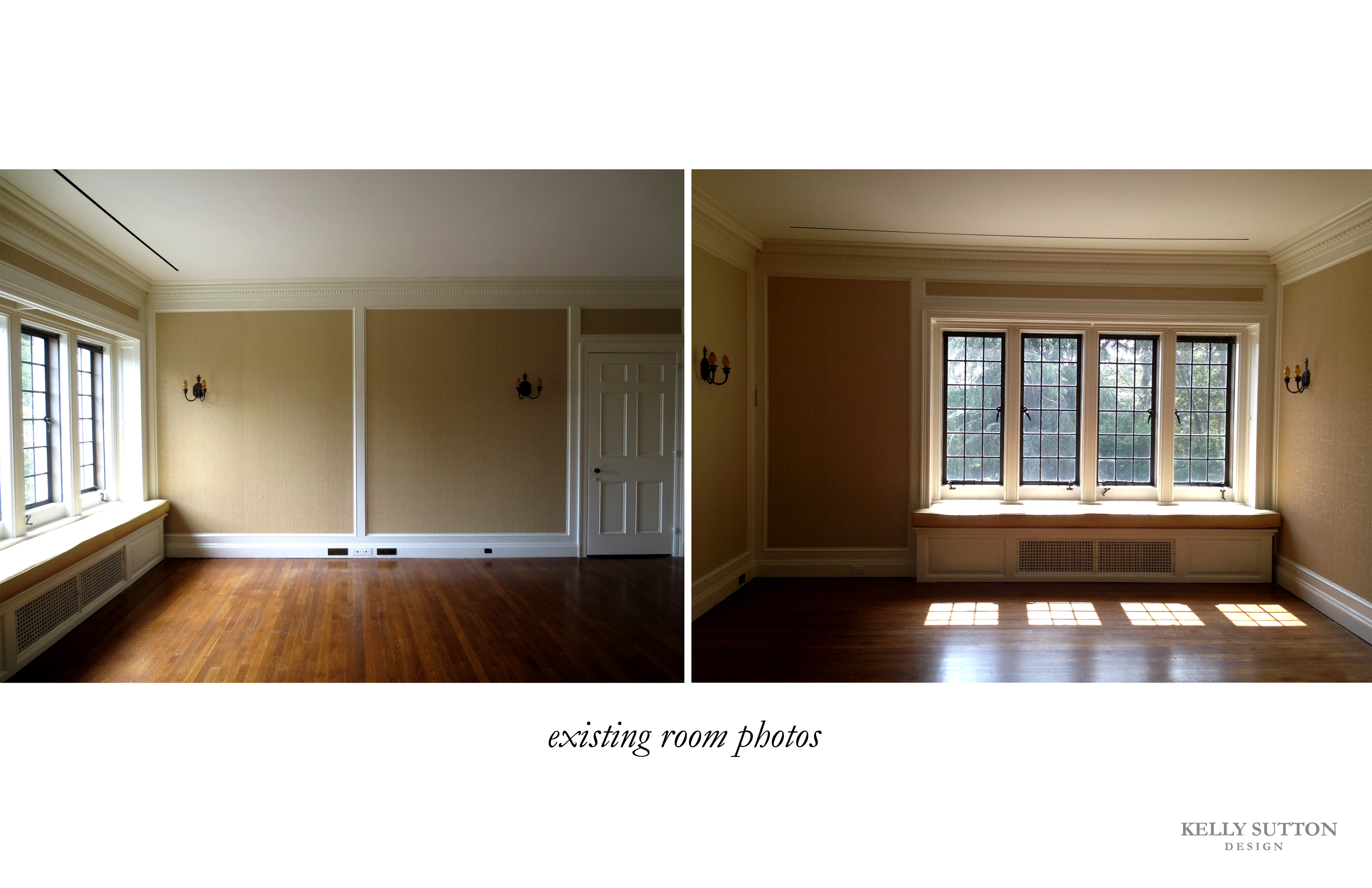
So.. with this blank canvas as her playground...
Kelly created this gorgeous moodboard....
...and formulated this plan....
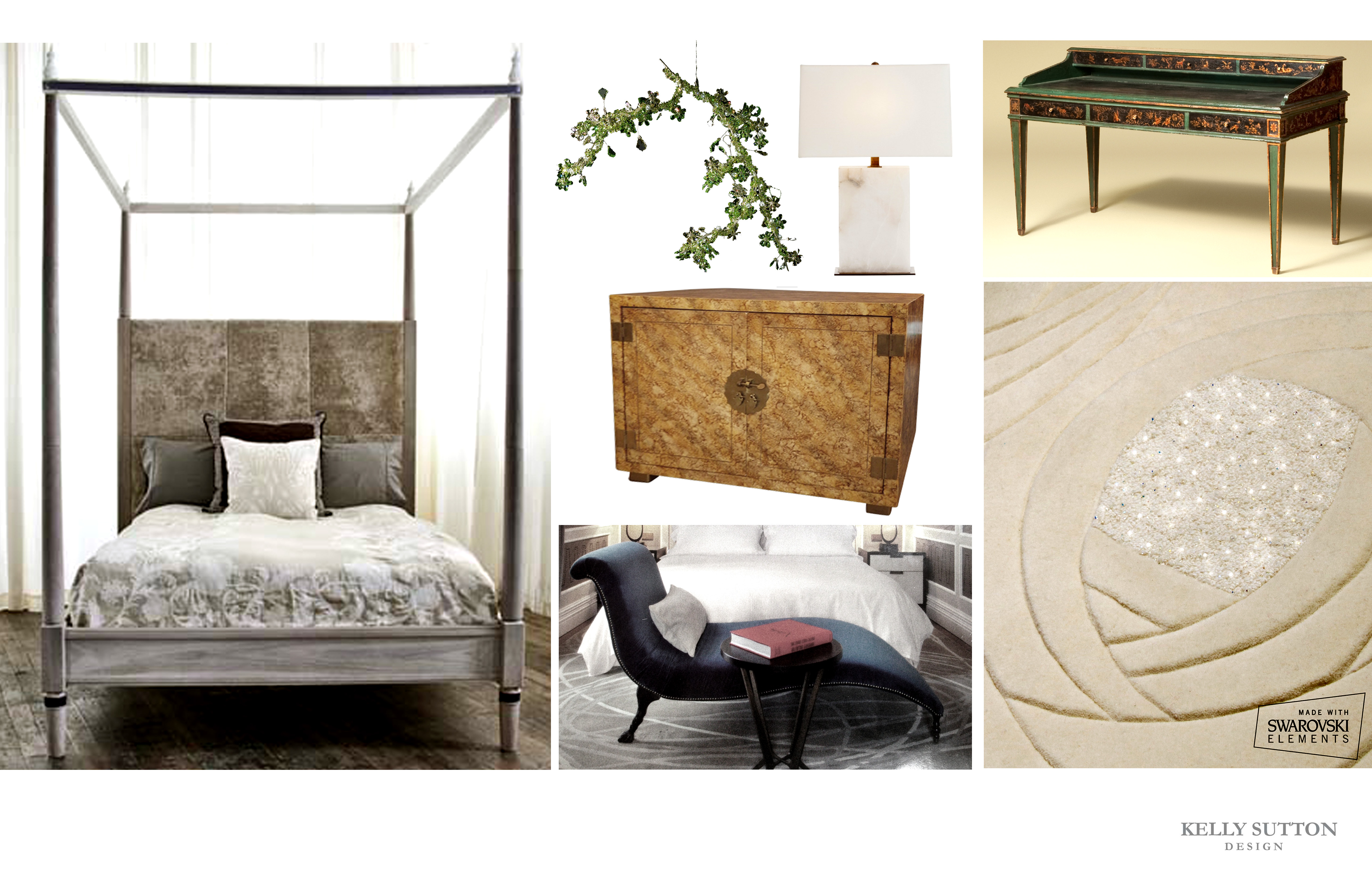
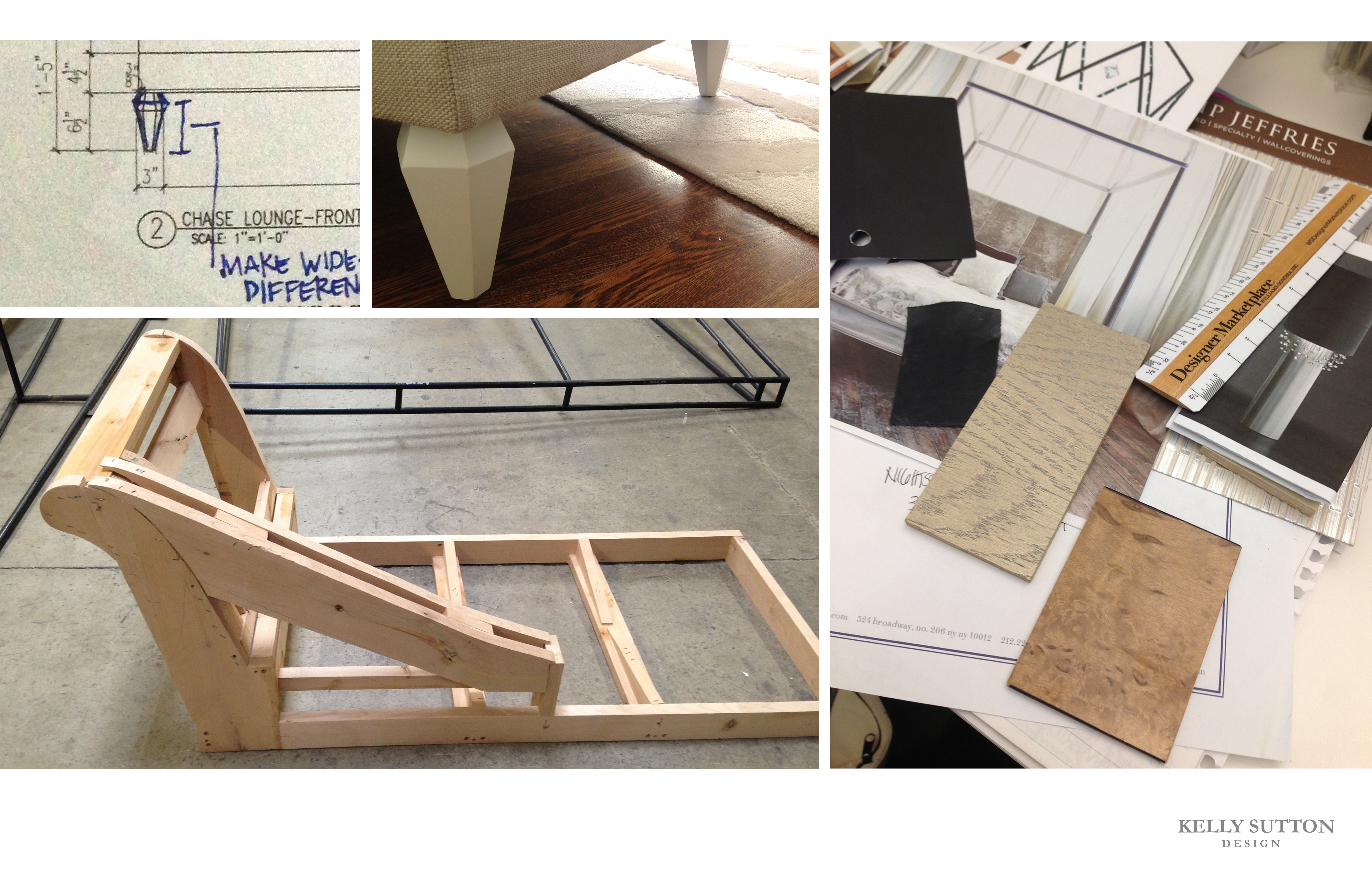
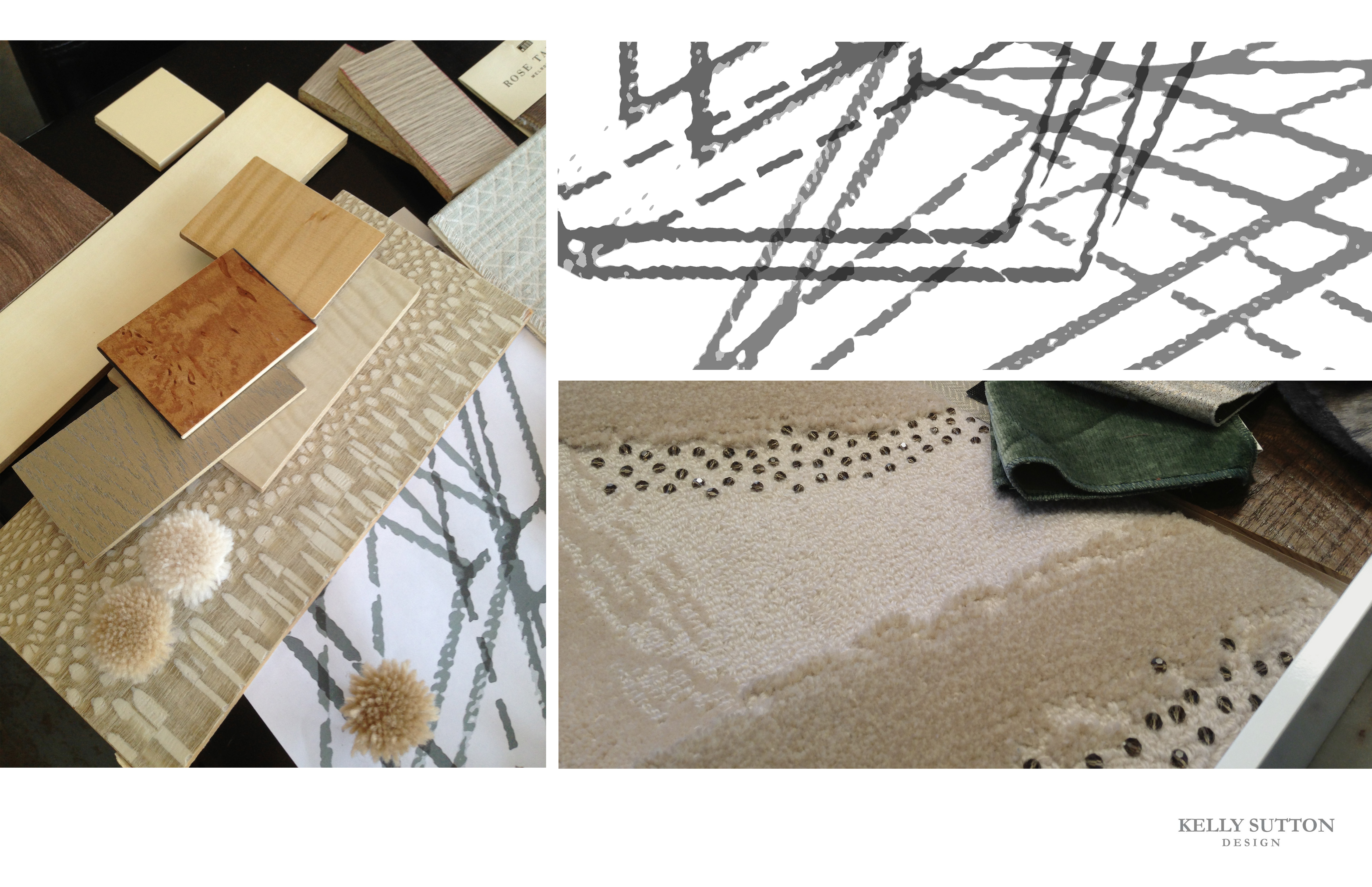
...so that she could take each beautiful finish/furniture piece/material and skillfully piece it all together to make this stunningly room come to life...
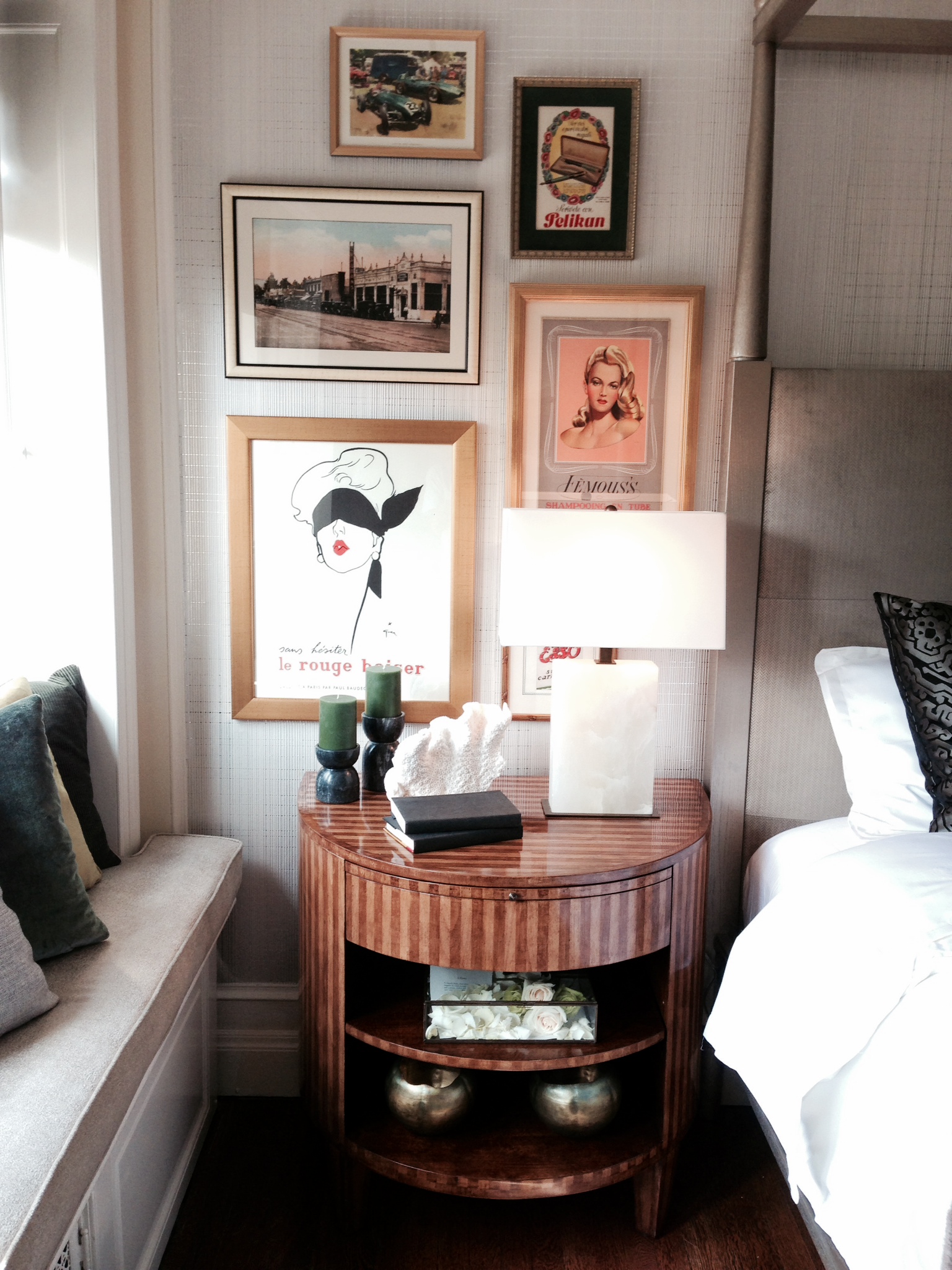
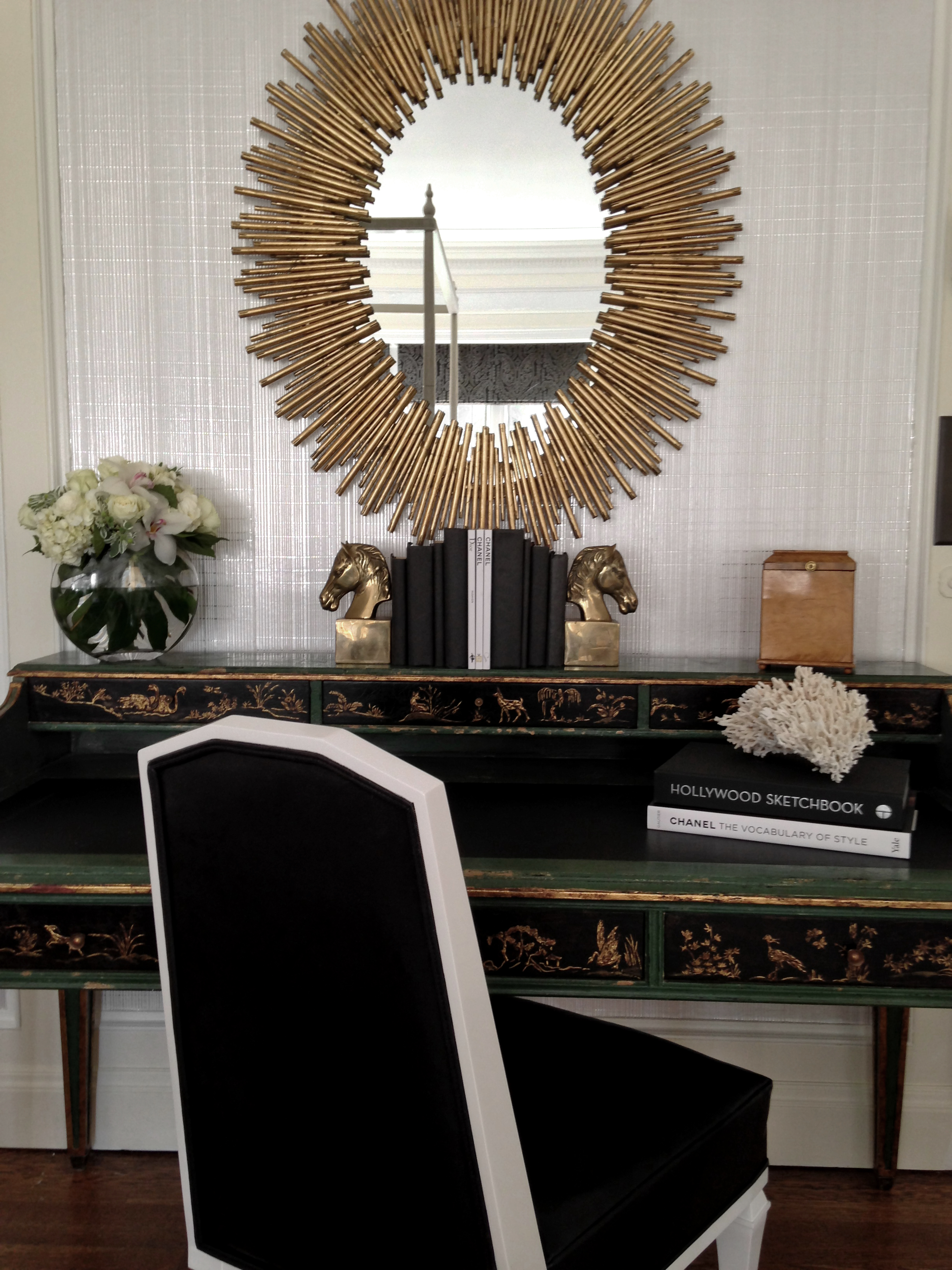
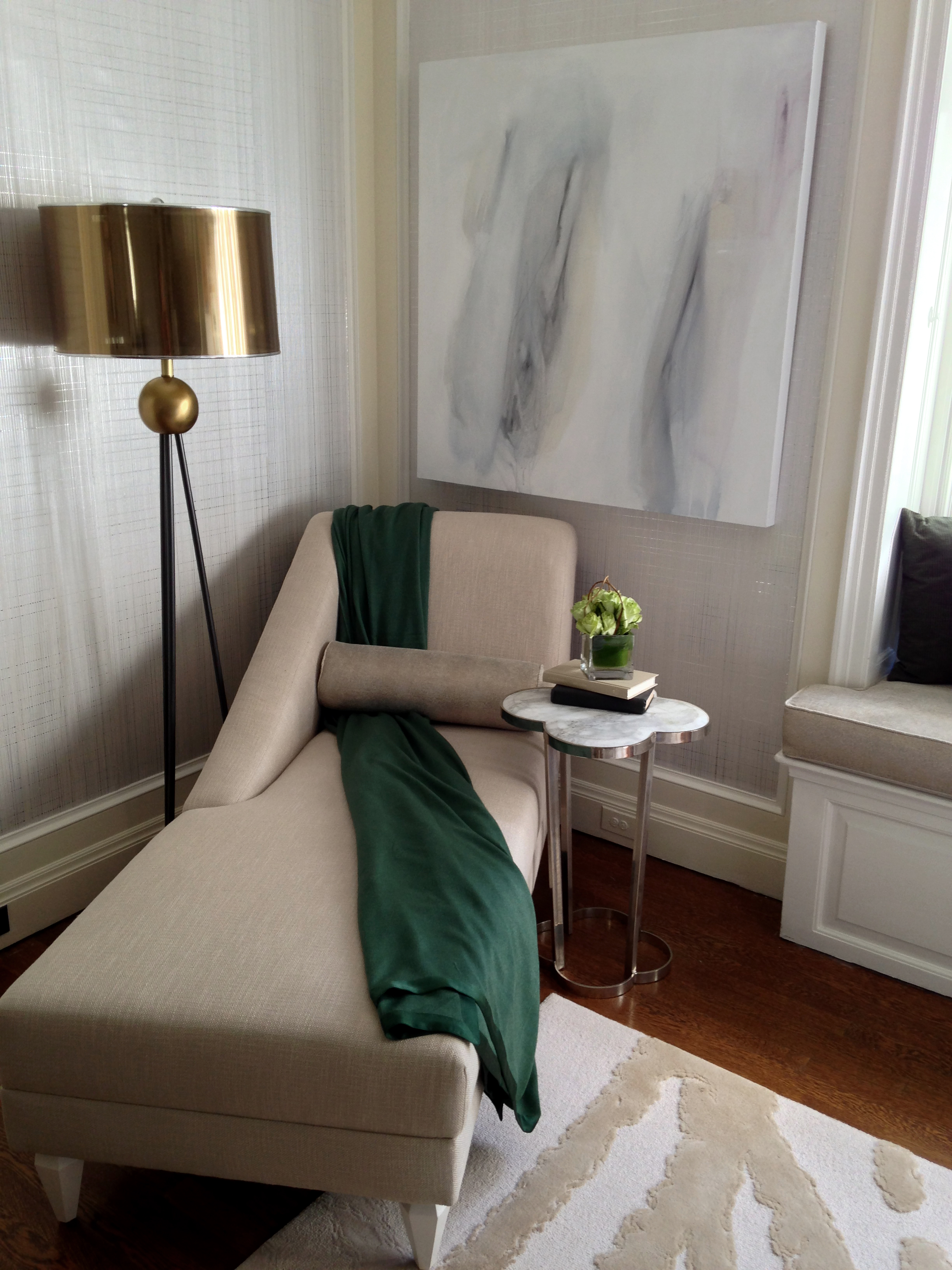
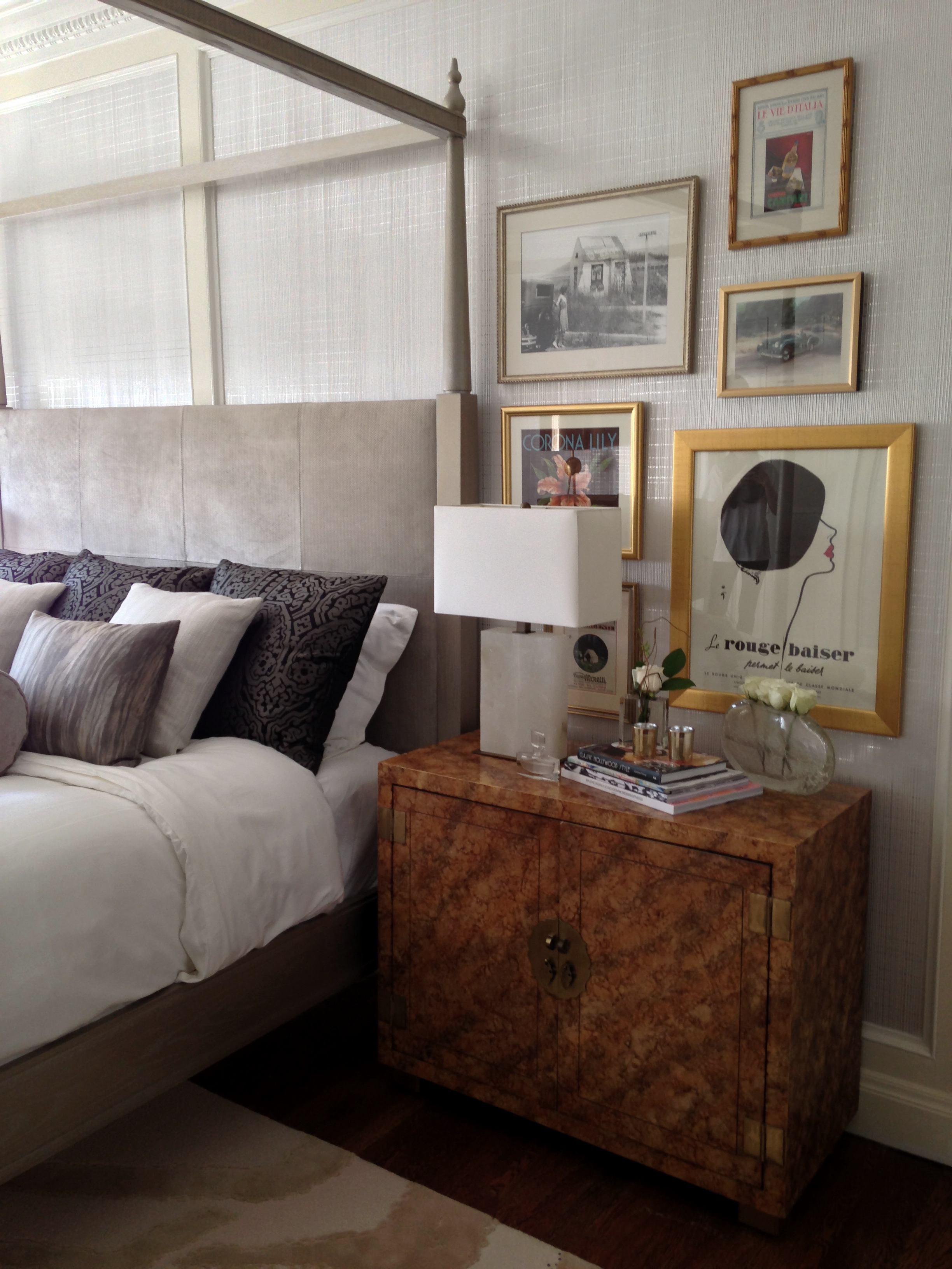
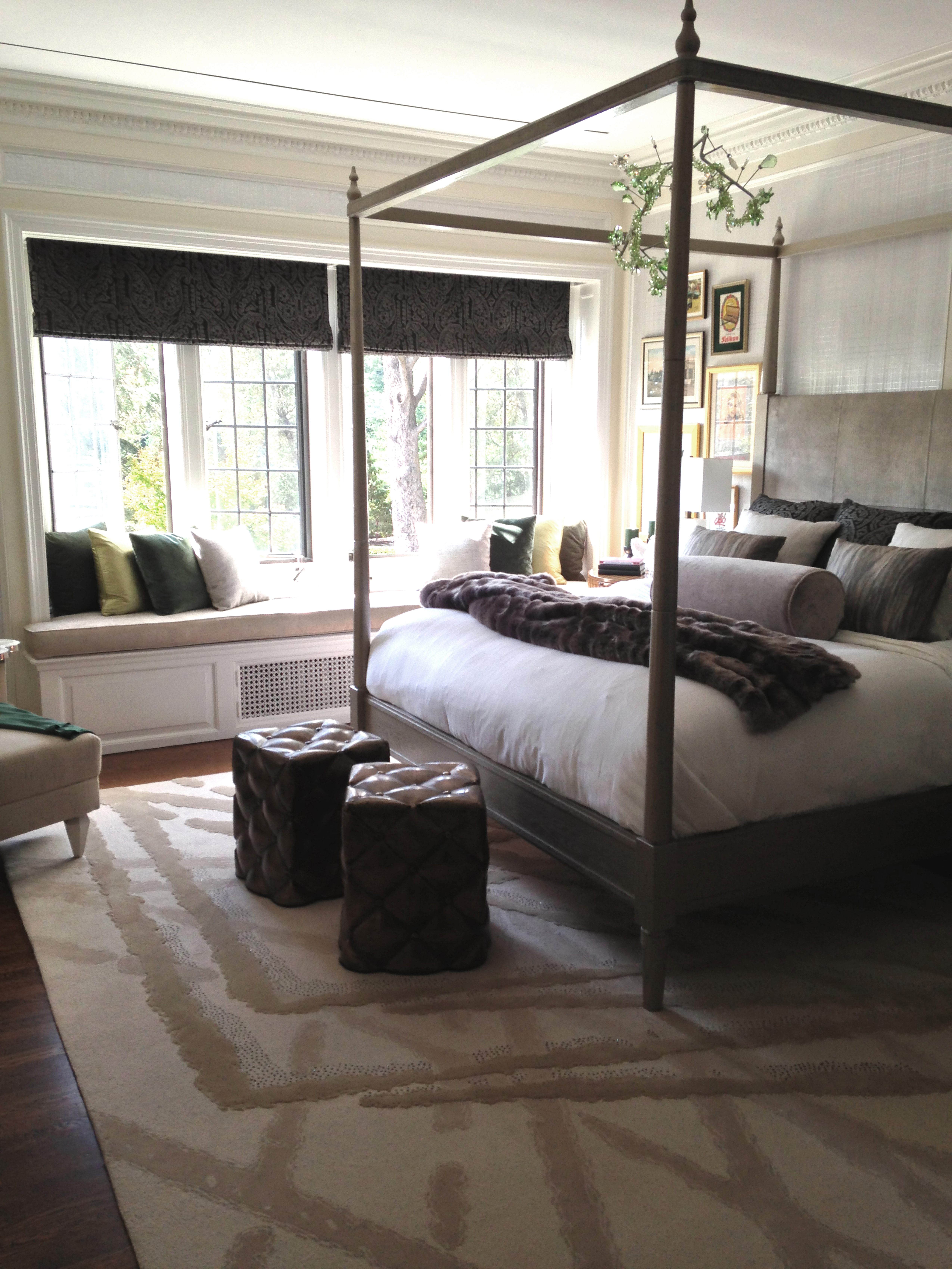
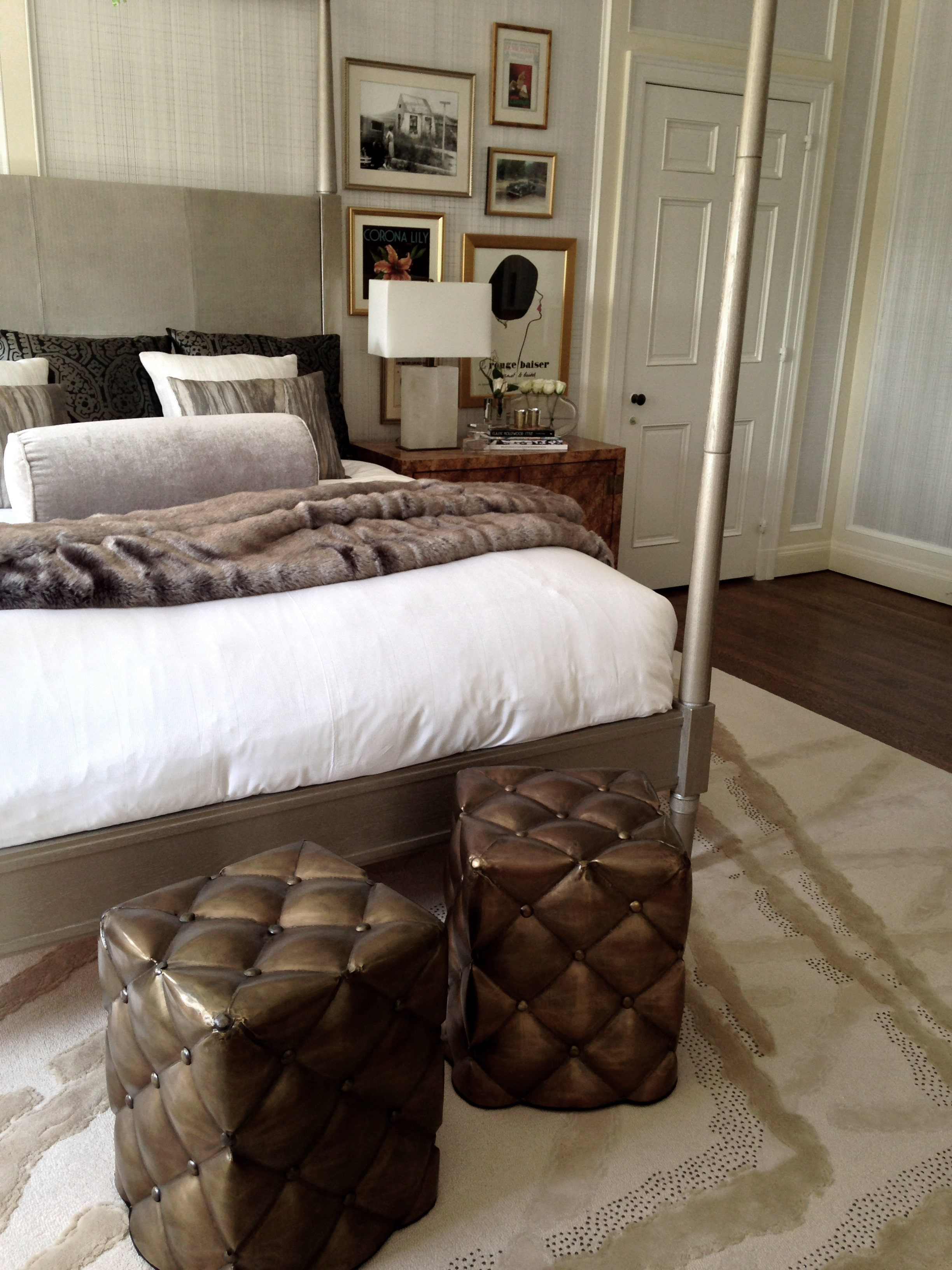
And from Kelly's own words...some amazing things to note...
"4 poster bed - by The New Traditionalists - custom finish - Champagne Color Cerused with silver gloss.
Sculptural element above Bed - Swarovski Crystal Spring Blossom.
Nightstands - They have almost the same honey colored finish but they are different in design. Left side is Rose Tarlow demilune style with a striped stain and right side is a vintage 1960's Henredon piece with an oil spot lacquer.
Many people have been surprised that the pairing of the silverized bed and the warmer finish nightstands works so well. But I really wanted to create balance in the room - the entire design is a mix of finishes. For me it needed that warmth to keep the balance. I wanted the room to feel effortless and collected.
Rug - Completely custom design for the show. I designed the pattern based off the abstracted and layered facets of a crystal. We did the whole design very neutral and tone on tone but used raised cut yarns and looped yarns to give the rug a lot of dimension. We also had smoky colored Swarovski crystal sewn in as accents along the raised pattern. It is subtle glamour.
Chaise Lounge - custom design for the show - the feet were designed after facets of a crystal.
Desk & Desk Chair - paired the Rose Tarlow Louis XVI Desk in a green and tete de negre distressed chinoiserie finish (a traditional feeling piece) with a more modern Reagan Hayes Henry Chair in a glossy white paint finish and almost a black patent leather from Moore & Giles. The chair definitely modernizes the desk.
Original Painting at Chaise - commission done for the show - by Mallory Page a New Orleans Artist.
There is chrome, brass, and bronze in the space. The "tufted" ottomans in front of the bed are actually bronze metal.
All of the framed prints above the nightstands are mainly vintage advertisements including a pair of Original Rene Gruau Illustrations - The Red Kiss, advertisement for smudge proof lipstick from the 50's, Gruau was a famous French fashion illustrator for Christian Dior."
As for my take...
I adore how this space feel glamorous but still understated in a way...it's not showy or grandiose but instead confident in its luxury and voice...humbly arresting if you will.
My favourite details are probably the wood side tables...love the counter balance of the natural burl against the crystals in the rug...such a great juxtaposition...and speaking of the rug, it's raised pattern is delightful with a capital D...also obsessed with the layered artwork and that incredible wallpaper...want the later somewhere in my house large styles...and finally, the desk and that whole little vignette over there...love, love, love.
Count me as one inspired wannabe/pseudo/working on it designer.
I only wish I could see this magic in person with live eyes...if you're lucky enough to live in Cali, you can find more information about when you can visit the show house here.
And now...more exciting stuff...because Kelly is so awesome, she's offered a giveaway for....
One of the prints curated for this very space!!!!!
Yup...that's right...you my friends have the chance to win an ORIGINAL framed ad chosen for this exact room!!!
The deets...
An Original Vintage French Ad for shaving cream called "Prep".
It is 16" W x 20" H (1.5' wide custom gold frame), off-white matte with a black bevel detail.
Retail: $650.
And here she is...
To enter:
Leave a comment below
For extra entries:
And please LEAVE A SEPARATE COMMENT FOR EACH!!!
1. Like Kelly Sutton on Facebook
2. Follow Kelly Sutton on Twitter
3. Follow Kelly Sutton on Instagram
4. Follow Kelly Sutton on Pinterest
5. Pin an image of her Greystone Mansion room to pinterest and include the hashtag #giveaway (please leave a link to your pin in the comments so I can find it)
6. Tweet the giveaway
[enter to win an original framed ad from @bijouandboheme and @KellySuttonInc
So that gives you a grand total of 7 chances to win!
The lucky ducky peep will be selected on Sunday- around 6 pm.
Good luck friends and big high fives to Ms. Kelly Sutton...gorgeous, gorgeous work.
xo
